Zonder
The project
Brand identity · Packaging · Visual system
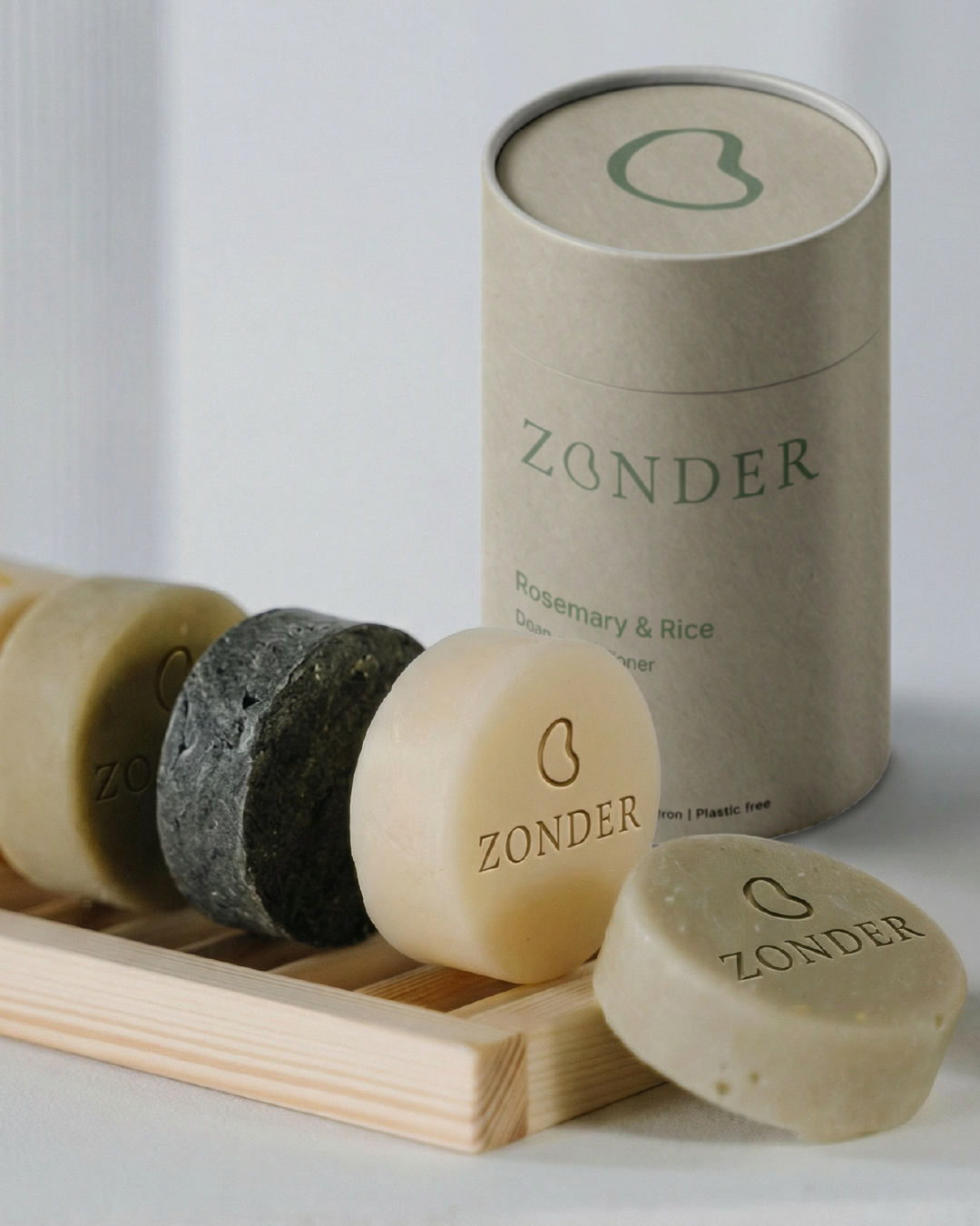
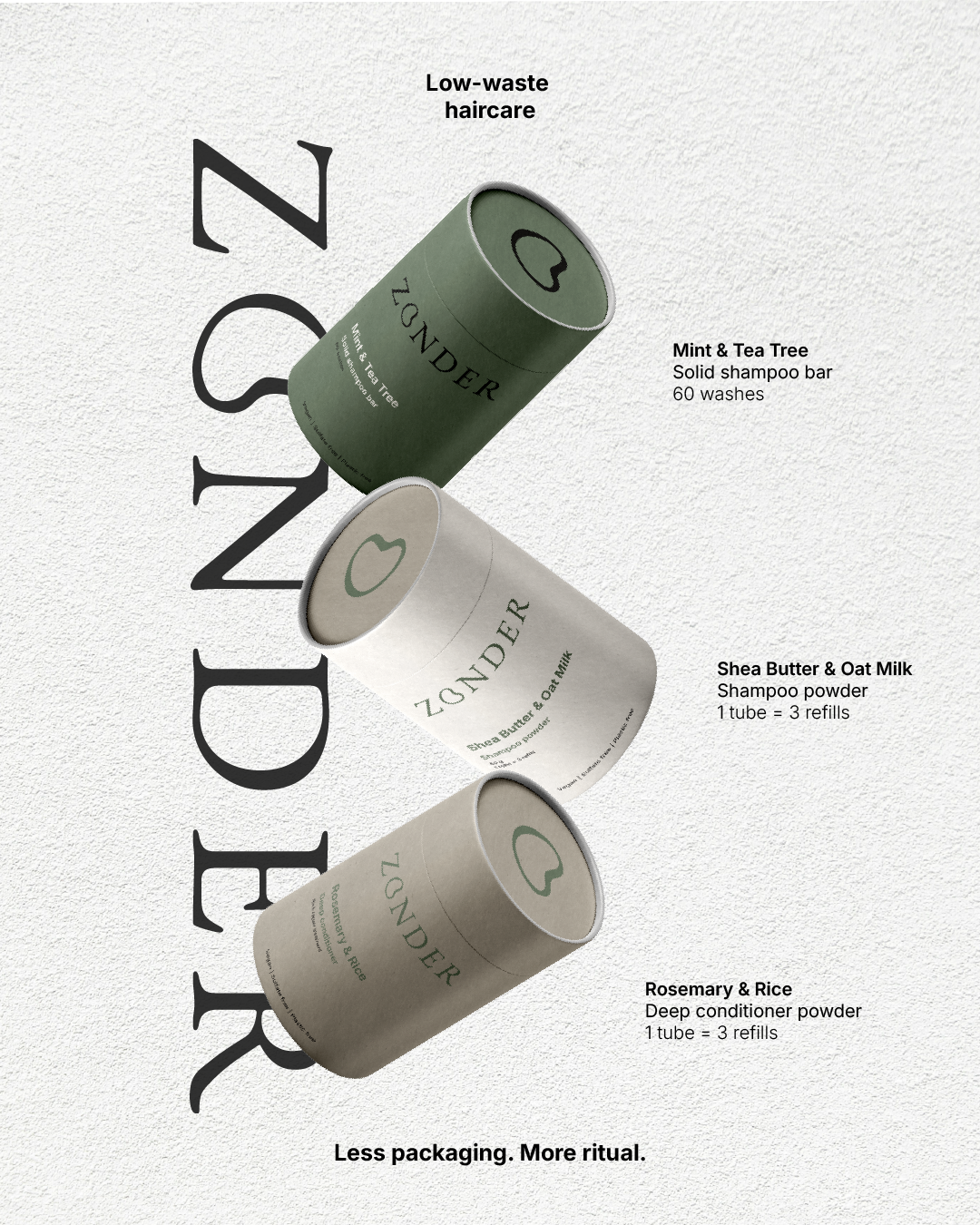
ZONDER is a low waste haircare brand focused on conscious beauty and minimal design.
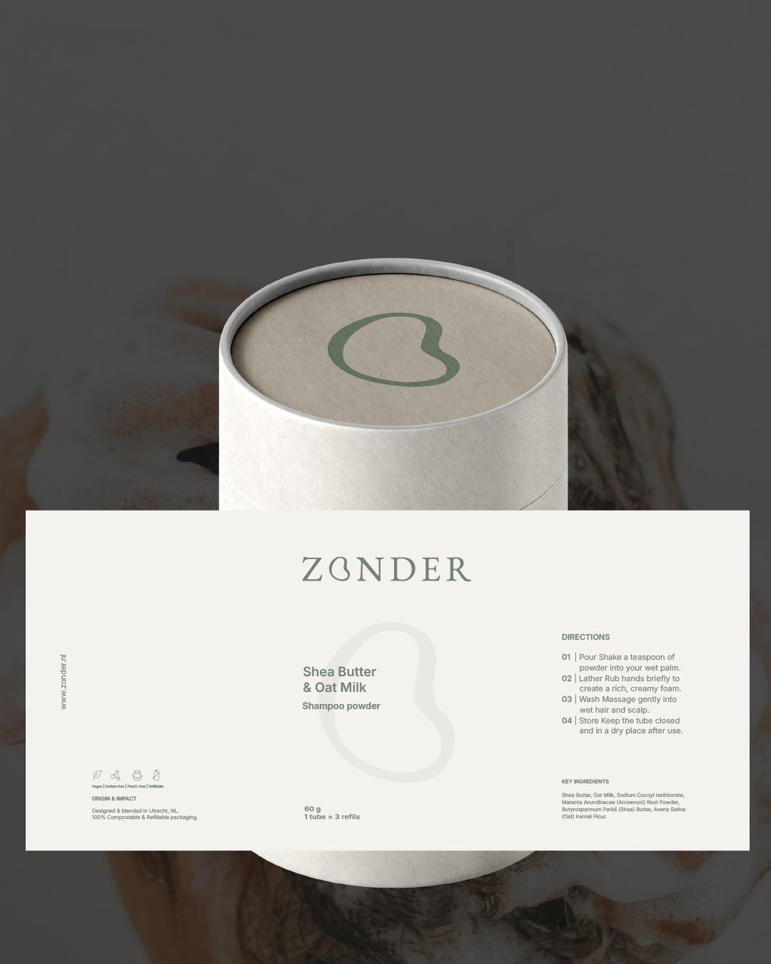
The scope included a complete brand identity, packaging design, and a supporting visual system built for both digital and physical touchpoints.
The challenge was to create a sustainable beauty brand that communicates trust, care and quality, without shouting sustainability.
ZONDER needed to feel:
modern, but warm
minimal, but not cold
eco-conscious, without feeling niche or preachy
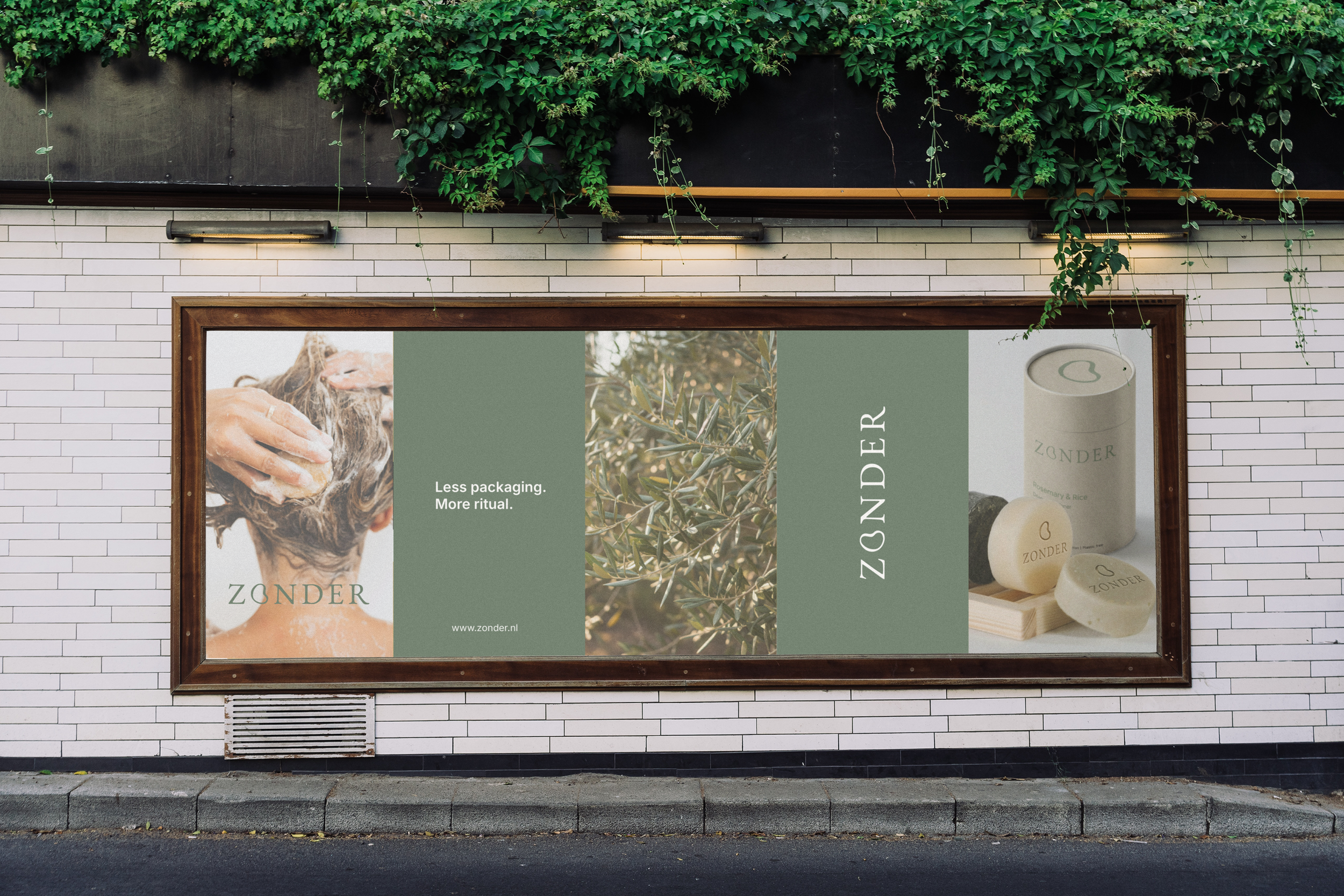
The brand had to work in real-life environments: bathrooms, shelves and daily routines, blending in quietly, yet confidently.
THE CHALLENGE
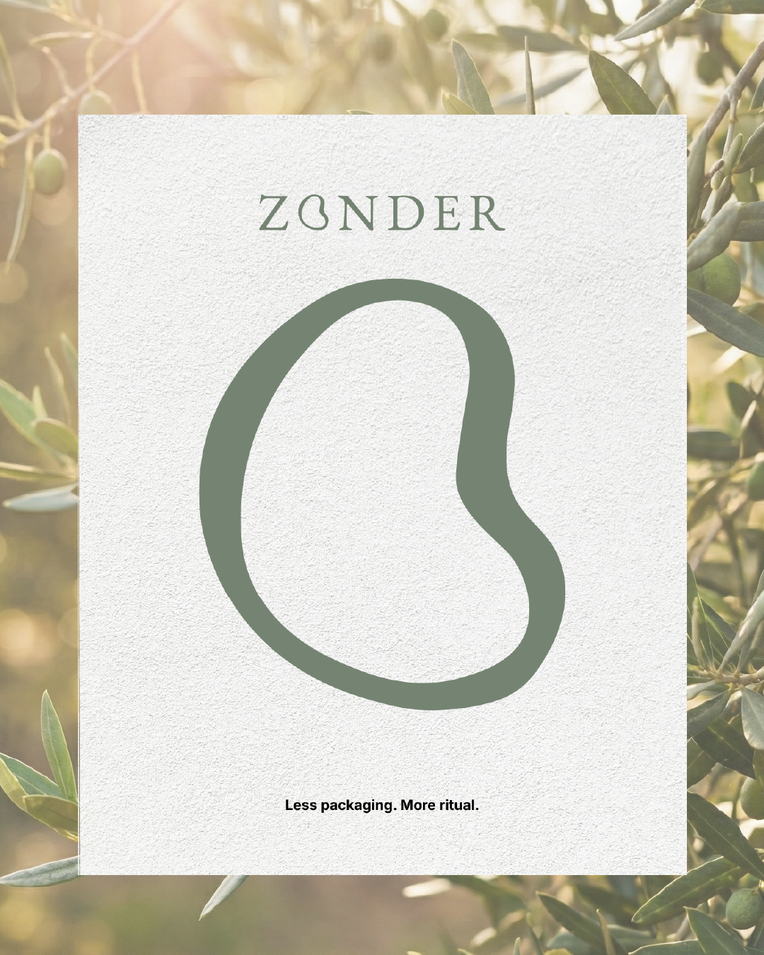
The concept behind ZONDER is built around one idea:
What we leave out matters just as much as what we put in.
Plastic-free thinking, restrained typography and a muted, natural color palette create a brand that feels calm, honest and intentional.
Inspired by slow living and modern editorial design, ZONDER positions low waste haircare as an everyday choice, not a compromise.
Every design decision supports clarity, longevity and ease of use, resulting in a brand that feels quietly bold and thoughtfully crafted.
THE CONCEPT
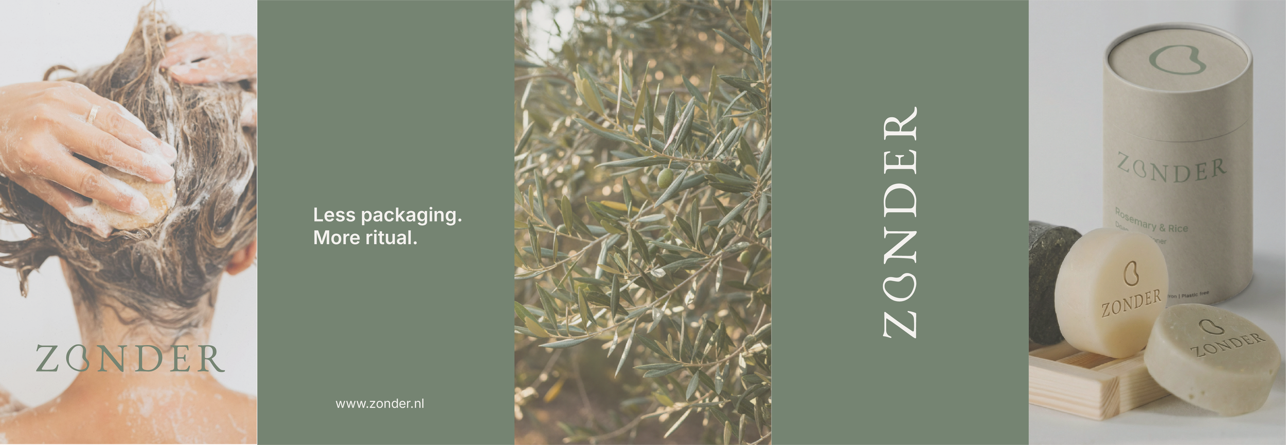
The result is a cohesive sustainable haircare brand identity that balances aesthetics and responsibility.
ZONDER demonstrates how conscious brands can feel elevated, modern and desirable, without excess.
This project showcases Studio Rugha’s approach to strategy-first branding, where concept, design and purpose work together to create brands that grow with intention.
THE RESULT